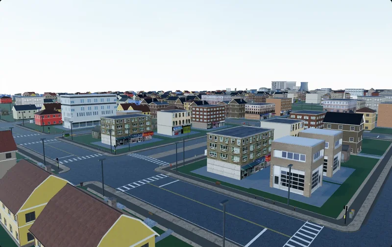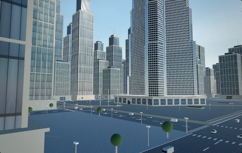
AI Interior Design in 3D: Why a Room Is Harder Than a Street
A room you can walk through is a different product from a picture of one. The clearances, the furniture graph and the lighting that decide which you get.
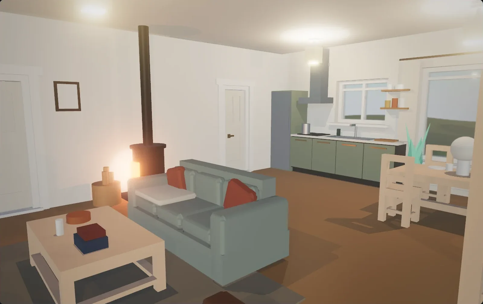
Ask an image model for a Scandinavian living room and thirty seconds later you have a photograph of one: white oak, a low sofa, afternoon light raking across plaster. Ask an agent for the same room in 3D and the first thing it settles is how wide the door is.
Interiors are the most requested thing in AI 3D and the most reliably disappointing, and the reason is not model quality. A room is a harder object than a street, even though it is a hundredth of the size.
A picture of a room and a room are different products
The AI interior design category is large and almost entirely image-based: upload a photo of your living room, choose a style, get a restyled photo back in fifteen to sixty seconds. Those tools are good at what they do, and none of what follows is a complaint about them.
What they do not produce is geometry. There is no sofa in the output; there are pixels arranged like a sofa. You cannot measure it, collide with it, walk behind it or export it. Move the camera and the room changes, because the model was holding a view rather than a room.
That decides which questions are askable at all. "Is the corridor wide enough" is a 3D question. An image generator will draw a 500 mm corridor and it will look wonderful, because in a photograph nobody walks anywhere.
One test separates the two products: point at something in the result and ask how big it is. If nobody can answer in millimetres, you have a picture.
Why a room is harder than a street
Exteriors are more work: a town is several hundred buildings, a furnished room maybe forty objects. Work and difficulty are different things.
The viewer is 600 mm away, not 30 m
In a street scene the nearest facade is 8 to 15 m away, and a window head 200 mm too low is invisible at that range. Inside, you stand with your hand on the worktop: at 1.05 m instead of 0.90 m you feel it before you have consciously looked. The same absolute error is a rounding difference outdoors and a defect indoors.
Everyone is an expert on rooms
Nobody has strong opinions about the correct width of an arterial road. Everybody has spent their life at 750 mm tables on 450 mm seats, passing under door heads a little above their own head without ducking. That knowledge is not verbal but it fires instantly, which is why generated interiors get called dreamlike: the proportions are quietly wrong everywhere at once.
Clearance is the difference between a room and a diorama
Outdoors most errors are cosmetic. Indoors they are functional, because the room has to be occupied. A chair 200 mm too close to the wall cannot be pulled out; a 700 mm corridor stops a character capsule; an island 800 mm from the run turns a kitchen into a shrine viewed from the doorway.
The numbers that hold a room together
These are conventions rather than physics and they vary by country, but they cluster tightly. An interior built to them reads as correct even when nobody can say why.
| Element | Figure that reads as correct |
|---|---|
| Door head | 2.0-2.1 m (leaves are 1981 mm in England and Wales, 2032 mm in the US, 2040 mm in metric Europe) |
| Ceiling | 2.4 m typical; 2.3 m is the UK minimum over 75 per cent of the floor, 2.5 m in London, 2134 mm under US residential code |
| Windows | Sill 900 mm, head 2100 mm, level with the door head |
| Kitchen worktop | 900 mm high, 600 mm deep; wall units 450-500 mm above it |
| Kitchen aisle | 1200 mm between opposing runs or round an island; 1000 mm absolute minimum |
| Corridor | 915 mm code minimum in a dwelling; 1067 mm before it stops feeling like one |
| Dining | Table 750 mm; 900 mm to pull a chair out; 1100-1200 mm to walk behind a seated person |
| Seating | Seat 450 mm; 350-450 mm from sofa front to coffee table; 1.8-2.4 m between facing seats |
Written into a brief these stop being trivia and become the constraint set the tool solves against. "A spacious kitchen" cannot be checked. "1.2 m clear between the island and the run" can be measured, and when it comes out at 800 mm you point at the sentence that was ignored.
Layout before objects
A room's function is a graph, not a shopping list
A kitchen is not a sink, a hob, a fridge and some cabinets. It is those three in a triangle whose legs run 1.2 to 2.7 m and whose perimeter stays between 4 and 8 m, with landing space either side of the hob and a route through the room that does not cut the triangle. A living room is a seating group facing one focal point, with circulation routed around it. A bedroom is a bed with a walkable side and a door swing that does not foul it.
Hand a generator a shopping list and it returns a shopping list: objects lined up around the perimeter like a school dance. Hand it the graph — what must be near what, what must face what, what must never be blocked — and you get a room.
Shell, then circulation, then furniture
Build the shell first (walls, floor, ceiling and openings, in metres), then the routes, then put furniture in what the routes did not claim. Furniture occupies the leftovers of circulation, never the reverse. Generating the sofa first and hoping a plan condenses around it fails the way generating buildings before roads fails outdoors — a location resolves as a layout before it resolves as geometry. Indoors the deadline is earlier, because there is far less slack to absorb the mistake.
This is where an agent driving a real editor pulls ahead of one-shot generation. Cuberta builds interiors the way it builds exteriors: walls, openings, furniture and lights go in as separate objects, the agent reads the scene back and corrects itself, and you can move anything it puts down.
The light problem
Outdoors, lighting is nearly free: one sun, one sky, and the shadows land where they belong. Indoors the sun is mostly blocked by the thing you just built, and what remains is a handful of sources you have to author yourself.
The most common failure in a generated interior is one bright point light in the middle of the ceiling: a flat pool on the floor, dark corners, walls that catch almost nothing and go grey, faces lit from directly overhead. Lighting practice long ago moved past that. The current EN 12464-1 stopped treating the horizontal work surface as the whole job and added targets for the surfaces around it, 75-150 lux on walls and 50-100 lux on ceilings. If the walls are dark the room is dark, whatever value sits on the ceiling fixture.
- Openings are light sources first, geometry second. A window with nothing behind it is a black rectangle, and the room loses the direction its light came from.
- Two to four practicals. A table lamp, pendants over the island with their bottoms 750 mm above the top, a strip under the wall units — each one an object and an emitter.
- Task light where the task is. Kitchens want about 300 lux generally and 500 at preparation surfaces; living rooms sit at 100-300.
- One colour temperature per room unless you have a reason. Domestic warm is 2700-3000 K; a 2700 K lamp beside a 6500 K panel reads as a bug, not a mood.
An interior is finished when someone standing inside it can tell you the time of day without looking out of a window.
Keeping the inside and the outside in agreement
Generate a house exterior and its interior in separate passes and they will not fit, and the drift is systematic rather than random. Interiors made alone come out generous, because rooms that photograph well in a wide shot are bigger than rooms people live in. Exteriors made alone come out compact. Together they give you four rooms of 5 by 6 m inside a footprint of 8 by 10 m. The fix is to share a few dimensions and force both sides to read from them.
- Floor-to-floor height. A 2.4 m ceiling plus about 0.3 m of floor build-up gives 2.7 m; the storey bands on the facade have to be that.
- Sill and head heights. 900 mm and 2100 mm on the inside face must be 900 and 2100 outside, at the same positions and in the same count. Counting windows from the garden and then from the landing catches more errors than any other single check.
- Wall thickness. External walls run 300-400 mm, partitions 100-125 mm. Zero-thickness walls give you a house whose inside is bigger than its outside.
What to check before you export
- Walk it, do not orbit it. Camera at 1.6-1.7 m, through the room at head height. An orbit hides everything the room exists for.
- Pass through every opening. A 762 mm door clears a character capsule of 0.3-0.5 m radius. A 600 mm gap between island and wall does not.
- Sweep the clearances. 900 mm corridors, 1200 mm kitchen aisles, 900 mm behind every chair that gets pulled out.
- Hunt intersections and floating. Interiors have far more object-to-object contact than exteriors, and contact is where both show: chair backs inside the tabletop, a rug through the floor, a 5 mm gap under a table leg that is invisible in a screenshot and unmistakable in a shadow.
- Check the backs, count the lights. You will see the back of the wardrobe and the wall behind the sofa. Every fixture that reads as a source should emit, or be knowingly demoted to a prop.
A brief you could hand to an agent
Describe the room the way you would describe it to a builder: dimensions, positions, clearances, light. Adjectives come last, and they attach to materials rather than to space.
A kitchen-diner, 4.2 by 5.6 m, ceiling 2.4 m. Door centred on the short south wall, 900 mm wide, head 2.1 m. Two windows on the north wall, sills 900 mm, heads 2100 mm. Base units along the west wall: fridge at the north end, sink under the left window, hob 1.2 m to its right with 600 mm of landing space either side. Worktop 900 mm high, 600 mm deep; wall units 500 mm above it. Island 2.4 by 0.9 m parallel to the run, 1.2 m clear between them. Dining table 1.6 by 0.9 m at 750 mm in the east third, six chairs, 1.1 m from the table edge to the wall. Oak worktop, matt grey-green units, plaster walls. Three pendants over the island, bottoms 750 mm above the top; a strip under the wall units; all lamps 2700 K; late morning light from the north.
Every sentence there is checkable. Compare "a cosy modern farmhouse kitchen with rustic charm": a good image prompt and an empty instruction to a modelling tool, because it constrains colours and constrains nothing you can stand in. In Cuberta a brief like that is a conversation rather than a submission — when the aisle comes out at 800 mm you say so, and the island moves.
What an agent is genuinely good at here is holding the numbers, the boring load-bearing part that people drop when they are tired: the worktop stays at 900 and the aisle at 1200 across forty objects without drifting. What it will not do is put the sofa somewhere interesting. It gives you a correct room, and correct is the floor, not the ceiling. The other honest limit is time, because a street can be judged from a screenshot and a room cannot. You have to walk it, at head height, through every door.